![11 Website Design Ideas for Insurance Agents [with Examples]](https://cdn.stratospherewebsites.com/source/sites/f3e55e7e-c318-4c72-96cd-0f8b33852cce/images/insurance-website-design-ideas-with-examples.jpg?v=283820250138208511217)
Like all modern-day consumers, prospective and existing insurance policyholders spend a considerable amount of their free time online. A website for your insurance agency can enhance your visibility to these internet users and play an important role in boosting your Google search rankings. Still, it's not enough to just have a business site.
You'll want to incorporate best practices for insurance website design to maximize conversions and enhance the ability of your online platform to generate income. This entails creating a site that your existing and prospective clients can easily access and enjoy using every time.
From responsiveness and navigation to web forms and page loading, here are some practical website design ideas for insurance agents.
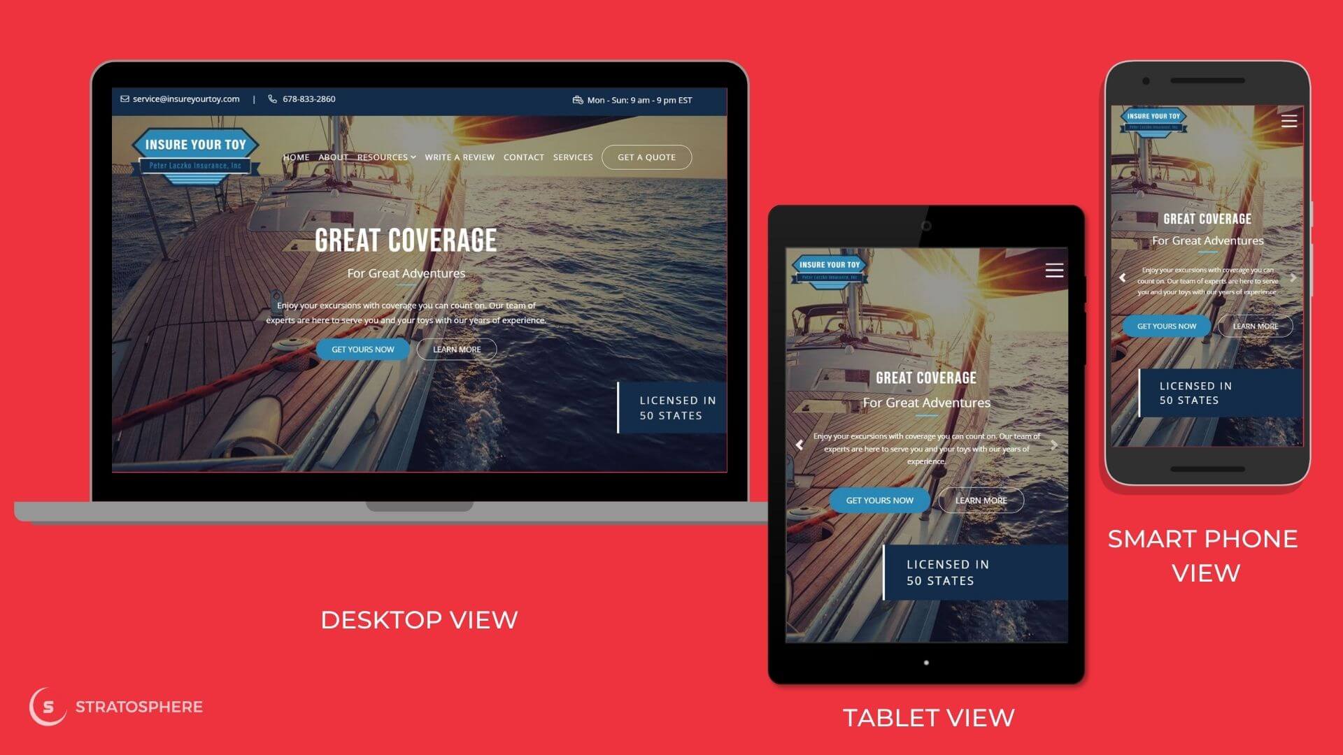
Billions of people around the world use mobile devices, such as smartphones and tablets, to browse the web. It's a mistake to design a website solely for desktop users as you'll miss out on traffic from mobile gadgets and other platforms. A responsive design maximizes visits to your insurance agency's website because users can easily access and navigate it from different mobile and desktop platforms.
Our client, Insure Your Toy's website is a perfect example of our work on responsive website design. When you access this site on a smartphone, tablet, or desktop, you can see how the rotating banner displays different coverage options perfectly and includes all the pertinent information across all three platforms. Navigation and the "Get Yours Now" CTA button function seamlessly, regardless of your preferred device or operating system.
Navigation plays a crucial role in how visitors to your website interact with your products/services, which is why a navigation design that promotes clarity and usability should be a fundamental part of your website design. There are several design patterns to choose from, such as breadcrumbs, vertical navigation, hamburger menu, etc., each of which should be tested for the overall user experience before implementation.
Seamless navigation is one way to enhance the user experience on your site and boost engagement. It means making it easier for prospects to find your web pages and content. Be sure to provide relevant menus and links and ensure proper categorization for each type of service, product, or resource. For example, grouping commercial insurance policies together makes it easier for business owners to find information on the available coverage options.
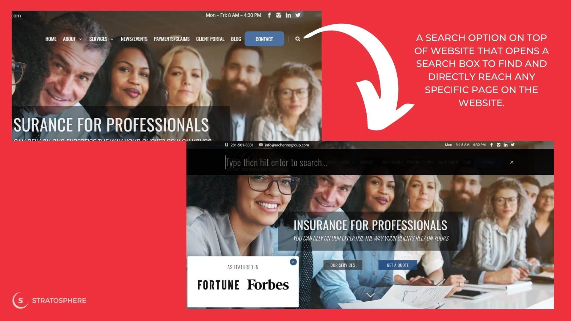
When you have published tons of content on your site, you should think of providing more than just navigational links to access it. A search box somewhere on top of your website that enables your users to type in their query and directly reach the right page on your website can be a great design and user experience related addition to your website. This will reduce users' time spent and steps taken on your site to reach the desired page. Look at how we did it for our client J. Archer Insurance Group's website:
On-brand live chat is one of the most impactful customer contact channels as it can help move prospective insurance buyers further down the sales funnel. Take a look at the live chat widget that we have installed on C.V. Mason Insurance's website.
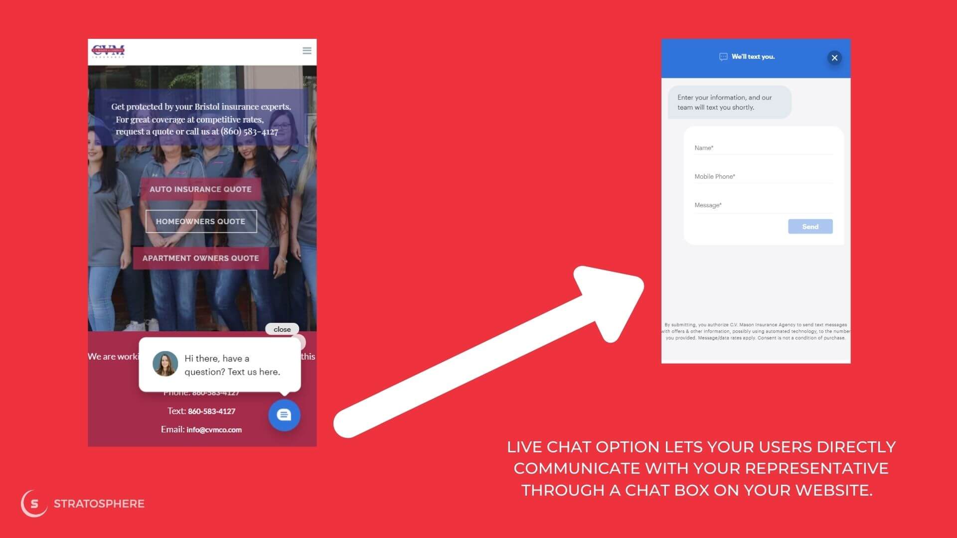
The feature is strategically located at the bottom right of the window, making it easier to spot without interfering with the user experience. It lets the visitor ask a question or write a message and leave their name and mobile number. Thus, their sales representatives can use live chat to influence purchase decisions by quickly answering or addressing issues raised by visitors.
CTAs (Call to Action) are the elements on your website that encourage your user to take the next step in your sales funnel—to click through and convert. You can have different CTAs on your page, but if they don't catch the user's attention and encourage them to take any actions, you won't be gaining the most out of all the traffic you get on your website.
Place your CTA in such a way that it easily catches a user's attention. Ideally, it should be placed where your users are most likely to look next. Ensure that it is large enough to be visible from a distance and on a small smartphone screen. Use colors that stand out from the color scheme of the rest of the page while still fitting in with the overall color palette. If you have any other secondary CTA on your page, make sure that both CTAs don't compete with each other in terms of how they look, where they are placed, and what actions they are asking your users to take.
Videos may not essentially be a part of the website's core design, but they do contribute to the overall appearance and offerings of a website. Embedded videos on page easily grab the user's attention even when they are aimlessly scrolling through your website. Many users may not want to read texts to learn about your offerings as they often expect the same thing to be written on every website for a specific service or product. However, if they come across a video on your website, they are more likely to play it, listening and retaining much more of the message than they would by reading the text. This helps establish a strong brand personality, increasing the credibility and trustworthiness of the brand, thus driving up more sales opportunities.
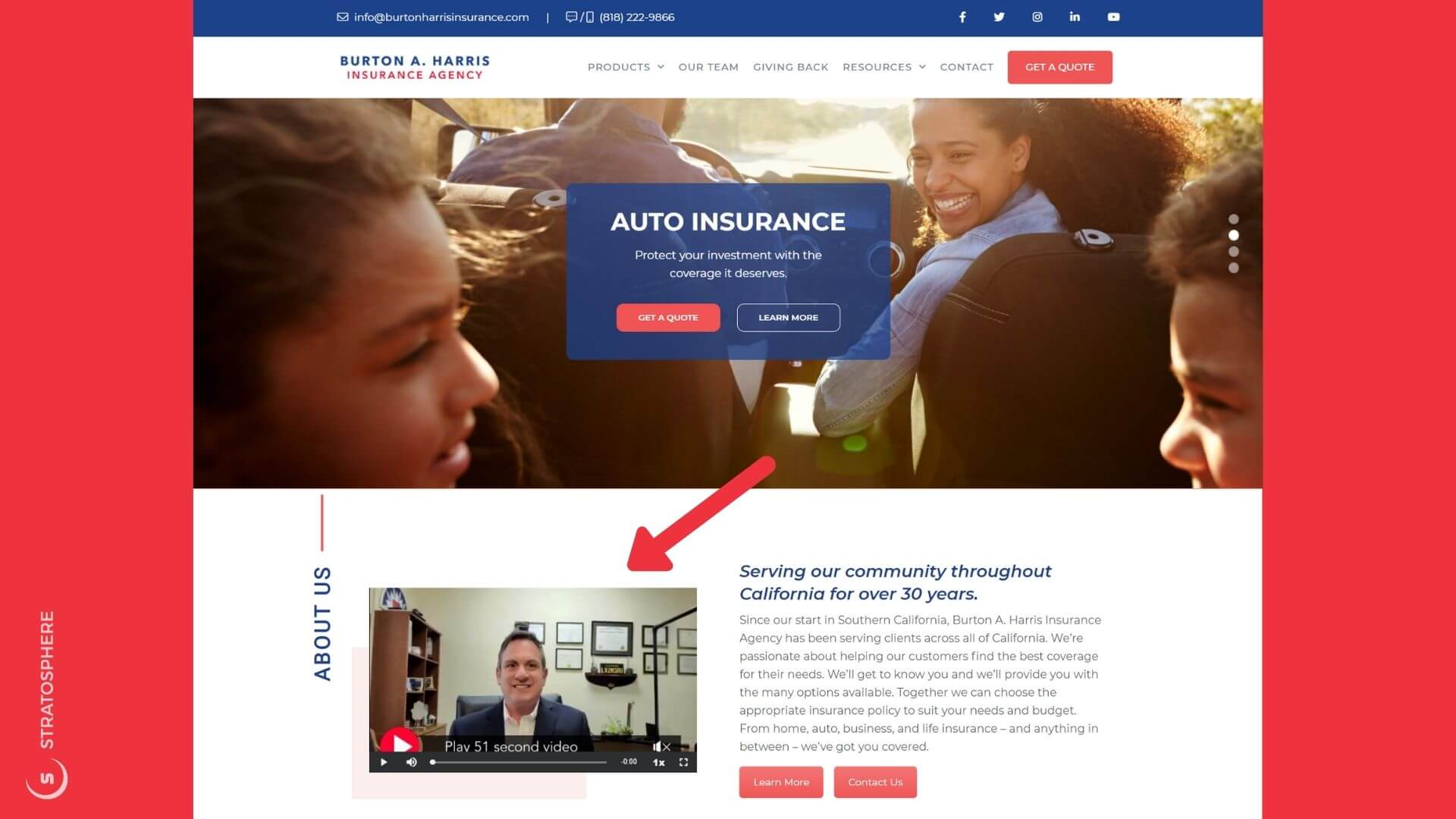
We implemented this video embedding strategy for many of our clients, and as a result, they noticed increased user engagement on the page and improved conversion rates. Look at this example taken from one of our clients, Burton Harris Insurance Agency's website.
In the 50-second video, the agency's founder talks about his and his team's experience in the insurance industry and includes a CTA at the end, inviting viewers to contact them for additional information. This has been an effective way for them to increase user interaction and drive sales.
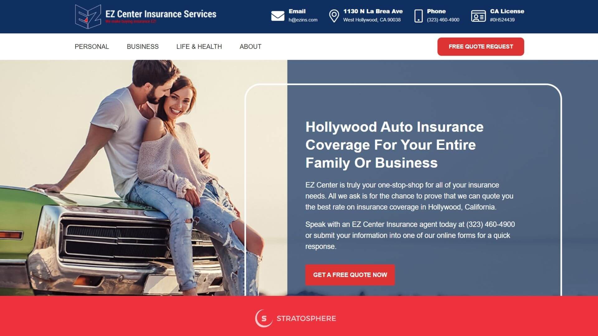
Designing your website to suit the audience you're targeting makes your site more interesting and boosts engagement. When choosing website layouts, themes, typography, and images, make sure to consider what your target audience cares about, what they're after, and the functionality you're providing. For example, EZ Insurance Services that targets the Hollywood area in L.A., has been using a more culturally relevant and instantly connecting overall design for their website. The dark blue background color symbolizing universality, the pictures with vintage cars denoting the lifestyle, and the exclusive red-colored CTAs compelling the users to take the next step all the while—everything on their website is done perfectly, just as it should be!
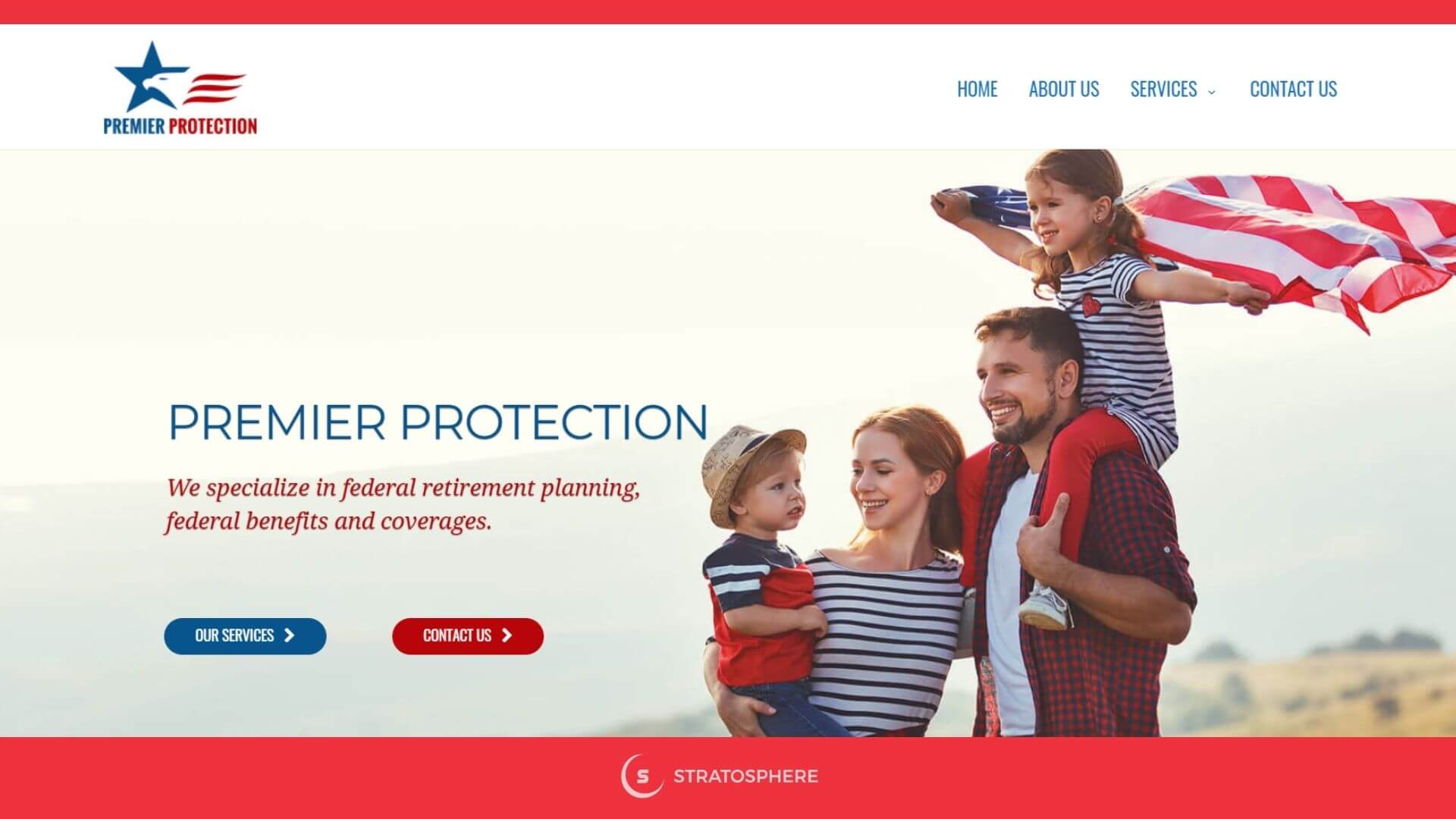
The theme on your website is an important part of the overall visual design and should be consistent throughout. Consistency allows the users to have a uniform, familiar experience, no matter which section of your website they're viewing. Premier Protection Insurance has pulled this off perfectly. The agency targets retired federal staff, which is why they have a U.S. flag on a banner. The flag color consistency is maintained in their logo, banner titles, and even the CTA buttons.
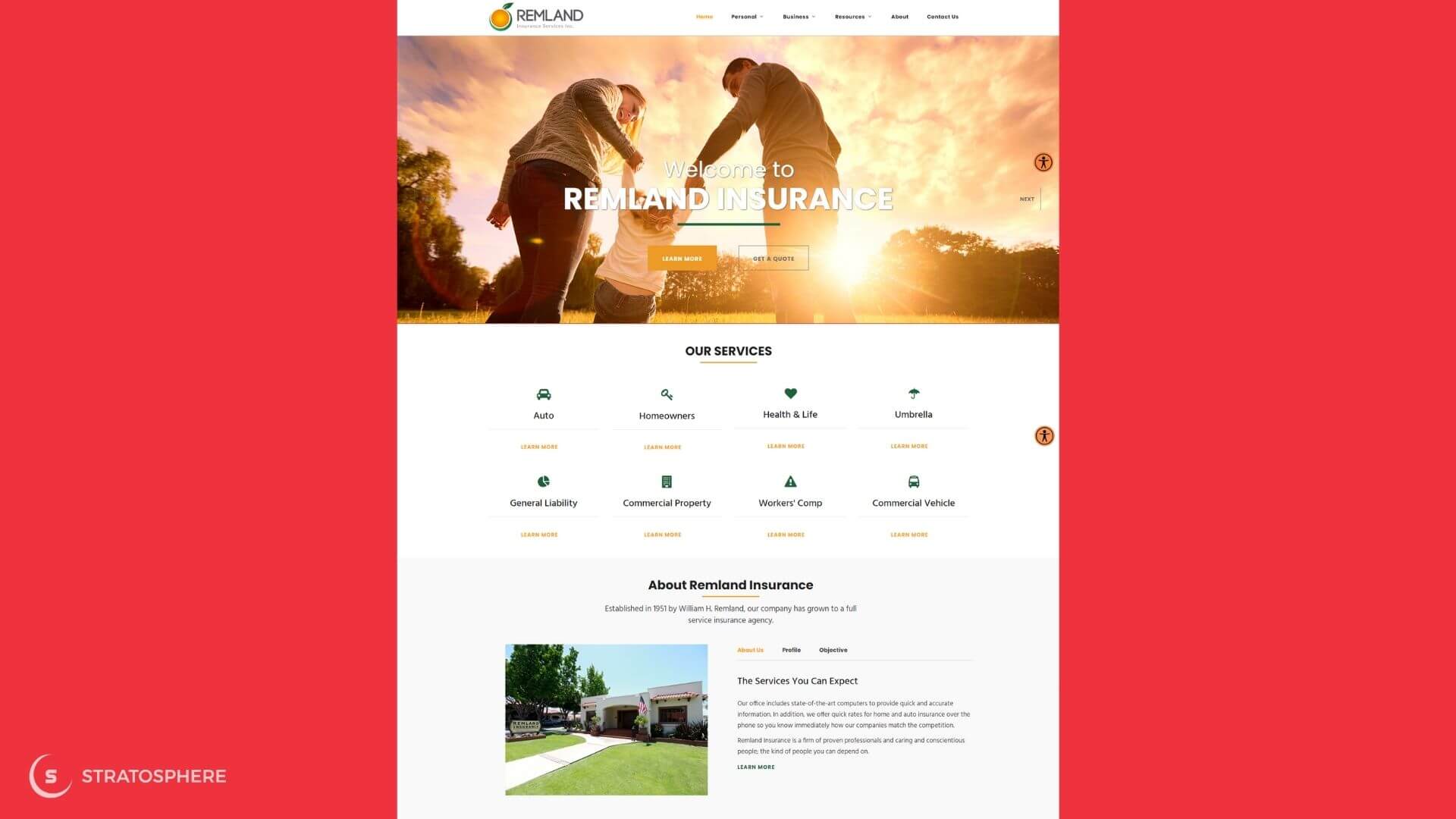
For Remland Insurance, there doesn't seem to be any obvious reason for their theme. Still, they have managed to use their tri-color theme (orange, green, and black) beautifully across their website. You can see the theme colors in their banner images, their logo, forms, and even in the content on their page.
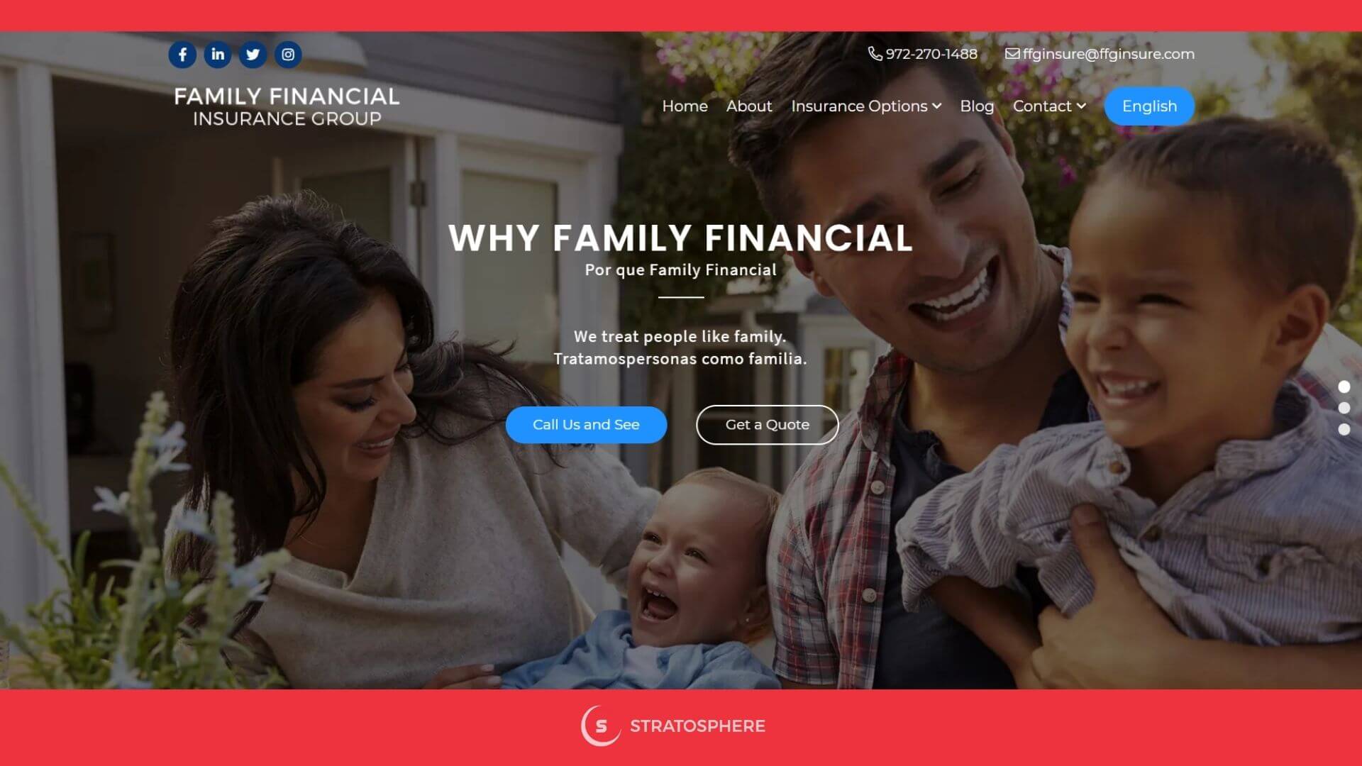
If there is a sizable population in your target location that speaks a second language, have a way to serve them as well through your website. Besides making more of your customers happy, a bilingual website can increase your search engine visibility, traffic, and engagements. Family Financial Insurance Group targets Texas residents, and they have Spanish-translated versions of only the important texts on their website. A few translated texts may not help a Spanish-speaking user with everything; however, it will at least help them get an overall idea of the services and encourage them to call the agency for more details. It's indeed a small and inexpensive website design idea to expand their reach beyond the non-English speaking population in the state.
With most business websites, clicking a CTA opens a web form for visitors to supply their contact information and send a message. Insurance agencies should take full advantage of such forms as these are some of the most critical conversion tools at a very advanced stage of the lead-to-sale process.
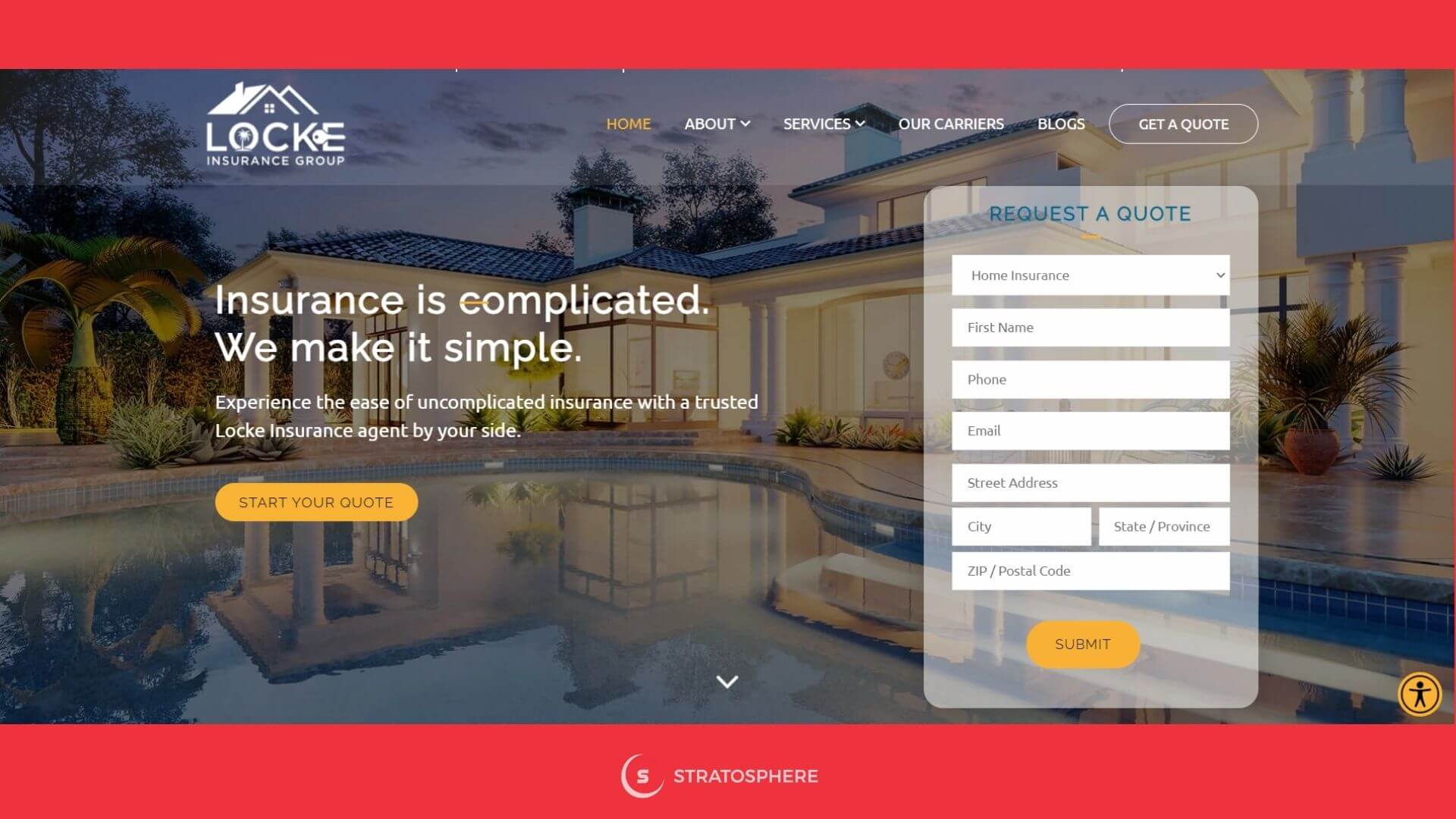
You may want to keep a universal form for everyone, with more input options (including address fields) but with clear categorization to let a user select their preferred option. Such lengthy forms may not get many submits as they require more details; however, if you are aiming for quality (more details about the prospect) over quantity, you may want to go with this kind of form. A fine example of this is the Locke Insurance website form, which asks for more details and clearly categorizes all prospects.
On the contrary, you may want to put up a form that aims to get more number of submits to increase your traffic-to-form-fill rates. For that, it's a wise choice to have a form that asks for only the barest details, like the prospect's name, email, and phone number, just like First Insurance has done on their website.
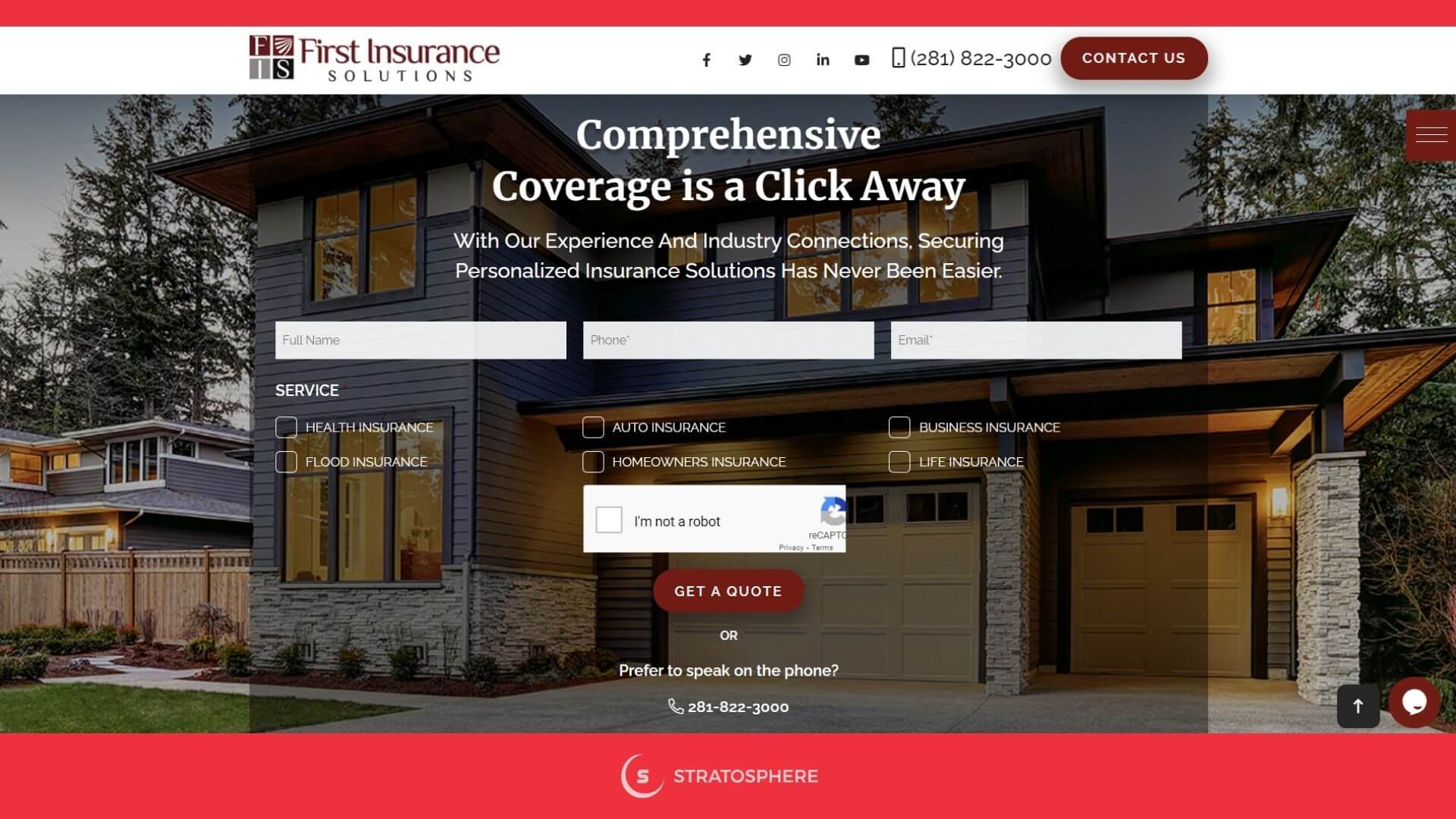
They have even provided the service category options in checkboxes instead of having them as a drop-down menu in another form field just to make it easier for their prospects to select their option quickly.
When your insurance agency's web pages load quickly, you'll achieve better results across an array of marketing metrics, from SEO and engagement to conversions. Try to keep the design as simple as possible since each feature or functionality you add impacts your page loading speed. Loading speed for low feature websites can also be bad if it's not neatly coded. By incorporating lean, user-centric web design, you can minimize the number of users abandoning your site after initially choosing you on SERPs. Ask your website designer about how they are planning to implement all your website design ideas without negatively impacting the loading speed of your website.
A professionally designed website can help fast-track the growth of your insurance agency in today's digital world. If your website doesn't guarantee optimum usability, user experiences, and conversions, it may be time to upgrade the design. Stratosphere offer best-in-class custom insurance agency website platform that comes with all the necessary features that you require to thrive and succeed on the web. Our insurance websites are fully customizable, integrates seamlessly with agency management systems and comparative raters, offers custom original content, and are 100% agency owned. Contact us today to learn more about our insurance agency website services!